KRU — The New Site.
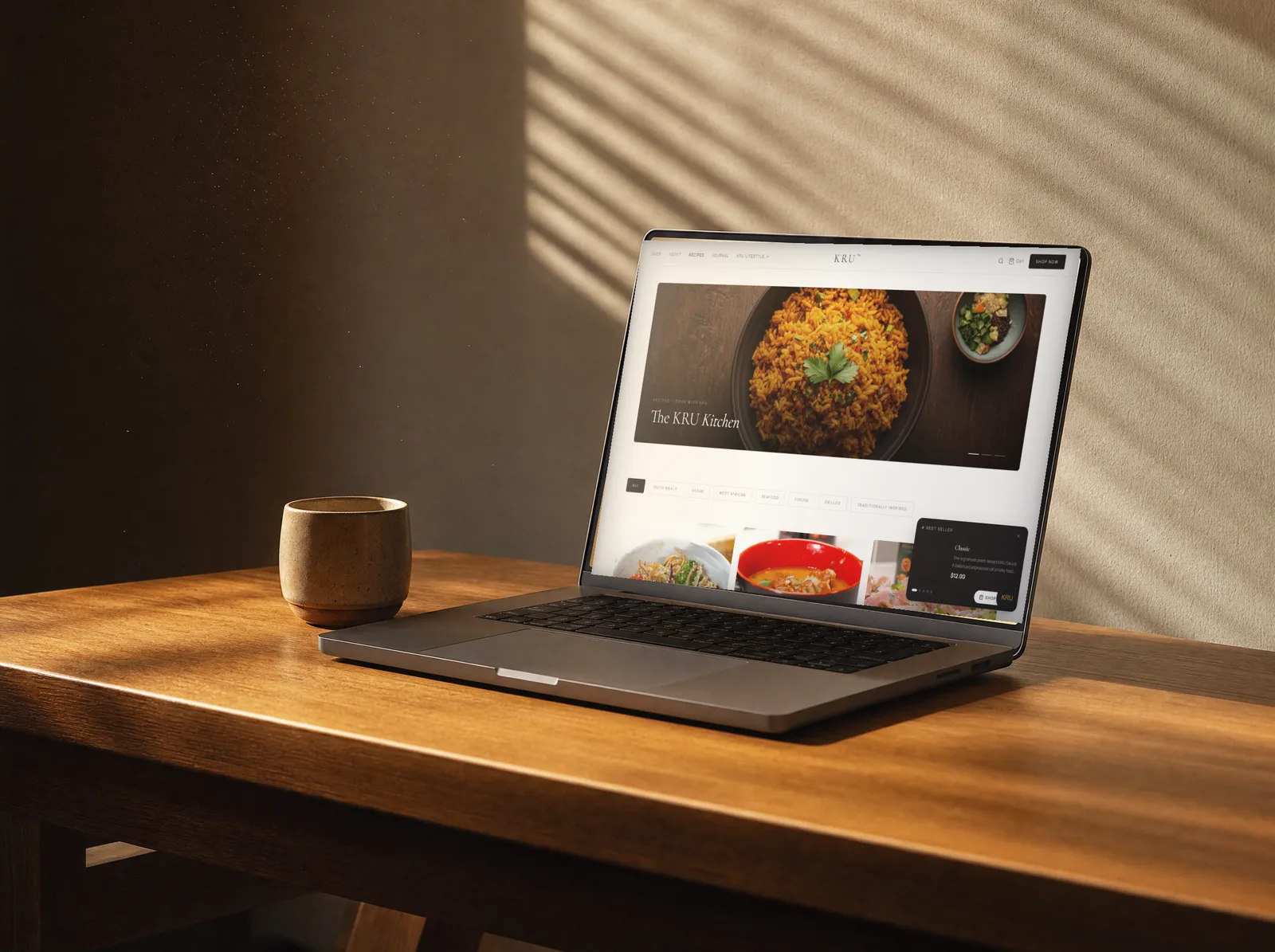
A full rebrand for KRU — from a crowded Shopify storefront to an editorial home where recipes, journal, market and shop speak one language, with a chat assistant that helps you pick your sauce.
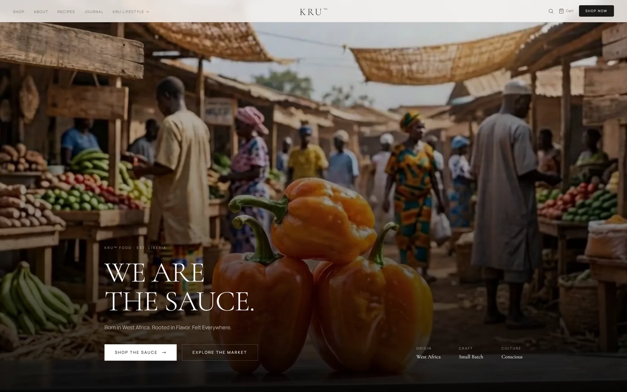
Home
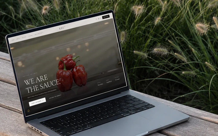
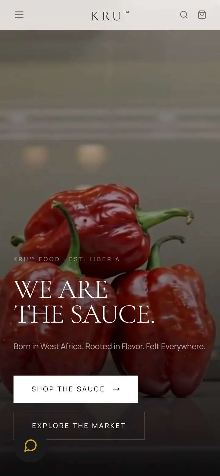
Desktop · 1920pxA sauce with a point of view, on a site that had none.
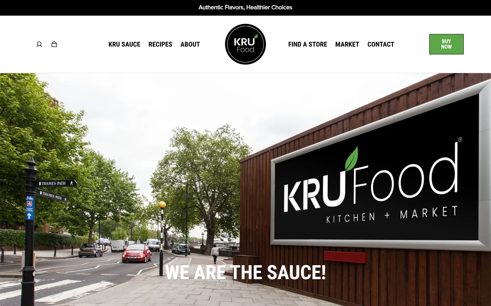
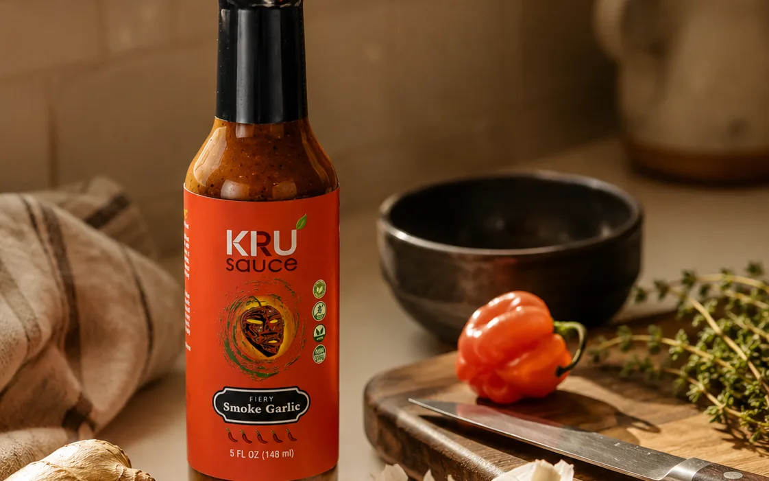
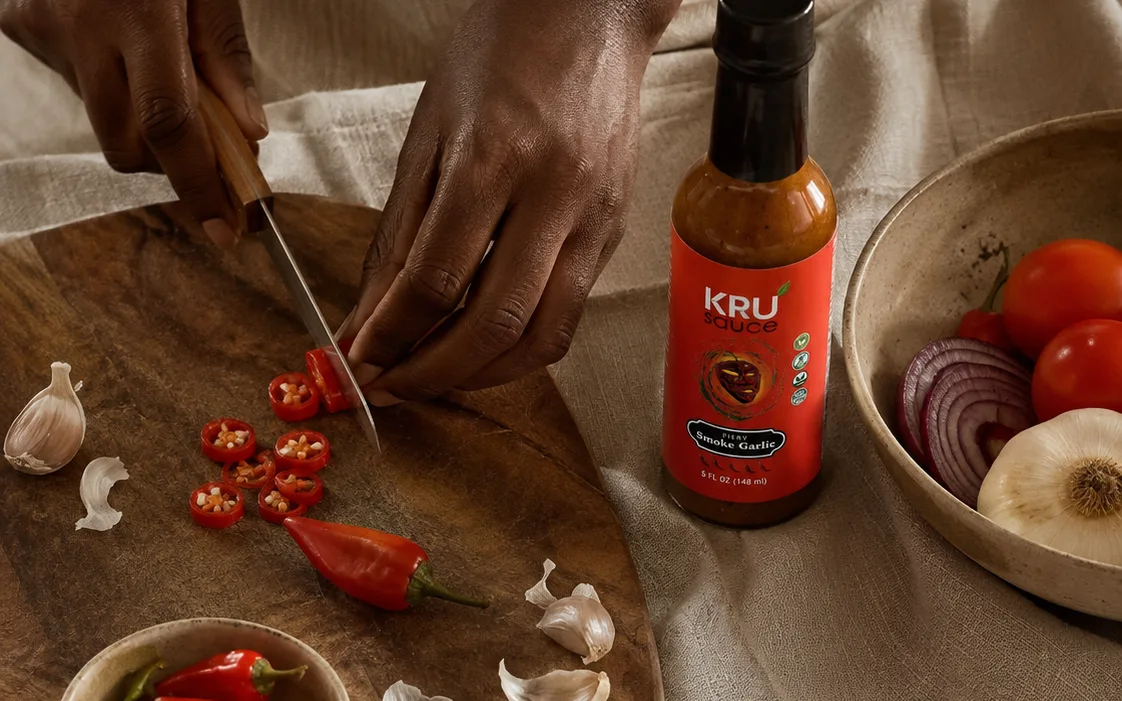
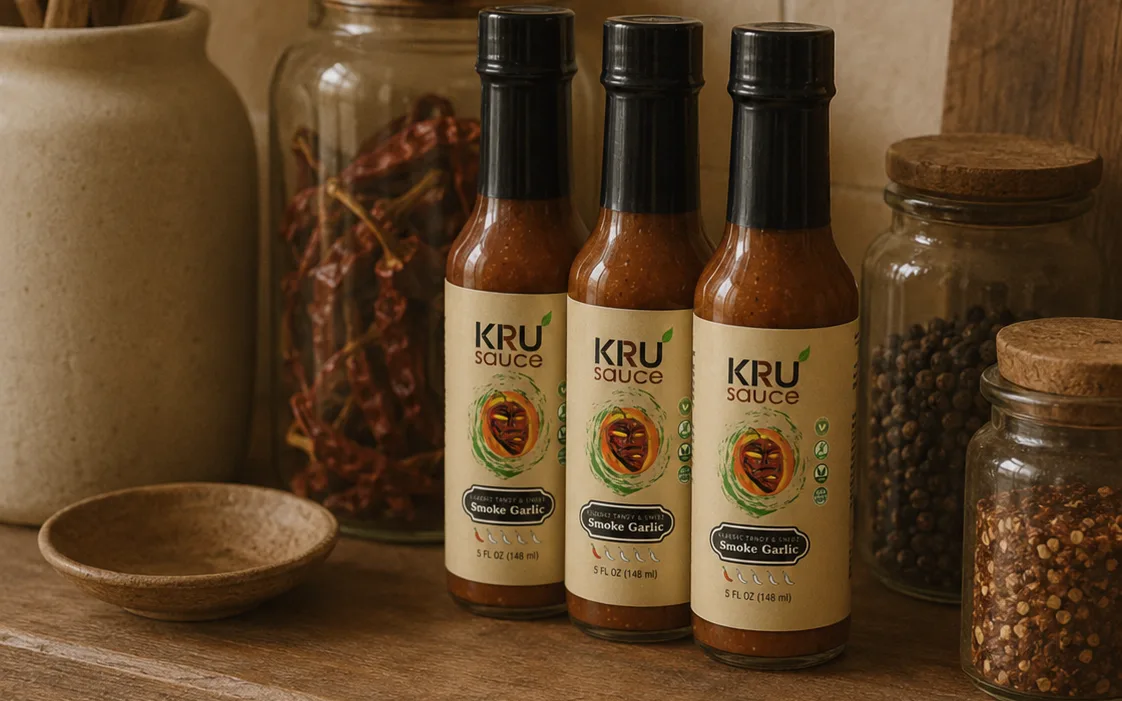
KRU sells West African hot sauce made in small batches. The old store did not say that. It led with a stock photograph of a London street, stacked its menu into a wall of links, and put a green Buy Now button where the story should have been. Drag the slider below to see it.
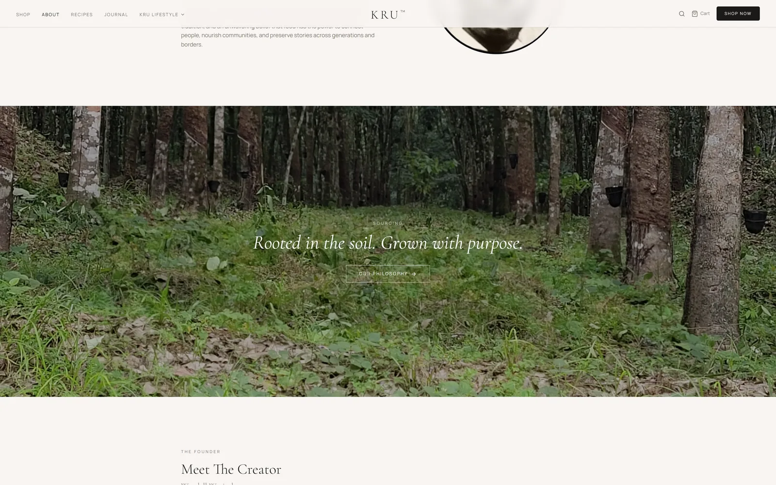
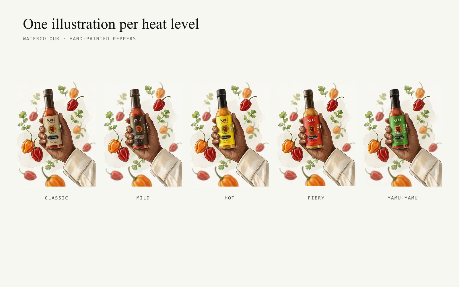
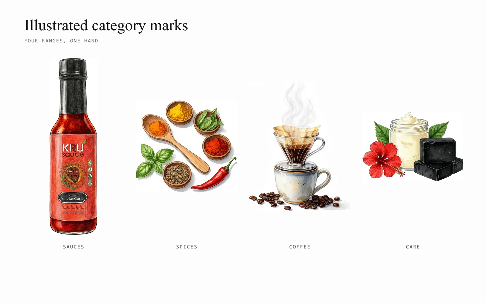
We rebuilt the whole thing as one editorial system. Thirty-three pages — recipes, philosophy, community, journal and shop — now share a warm identity, a high-contrast serif and a magazine rhythm, so reading a recipe and buying a bottle feel like the same act rather than two different websites.
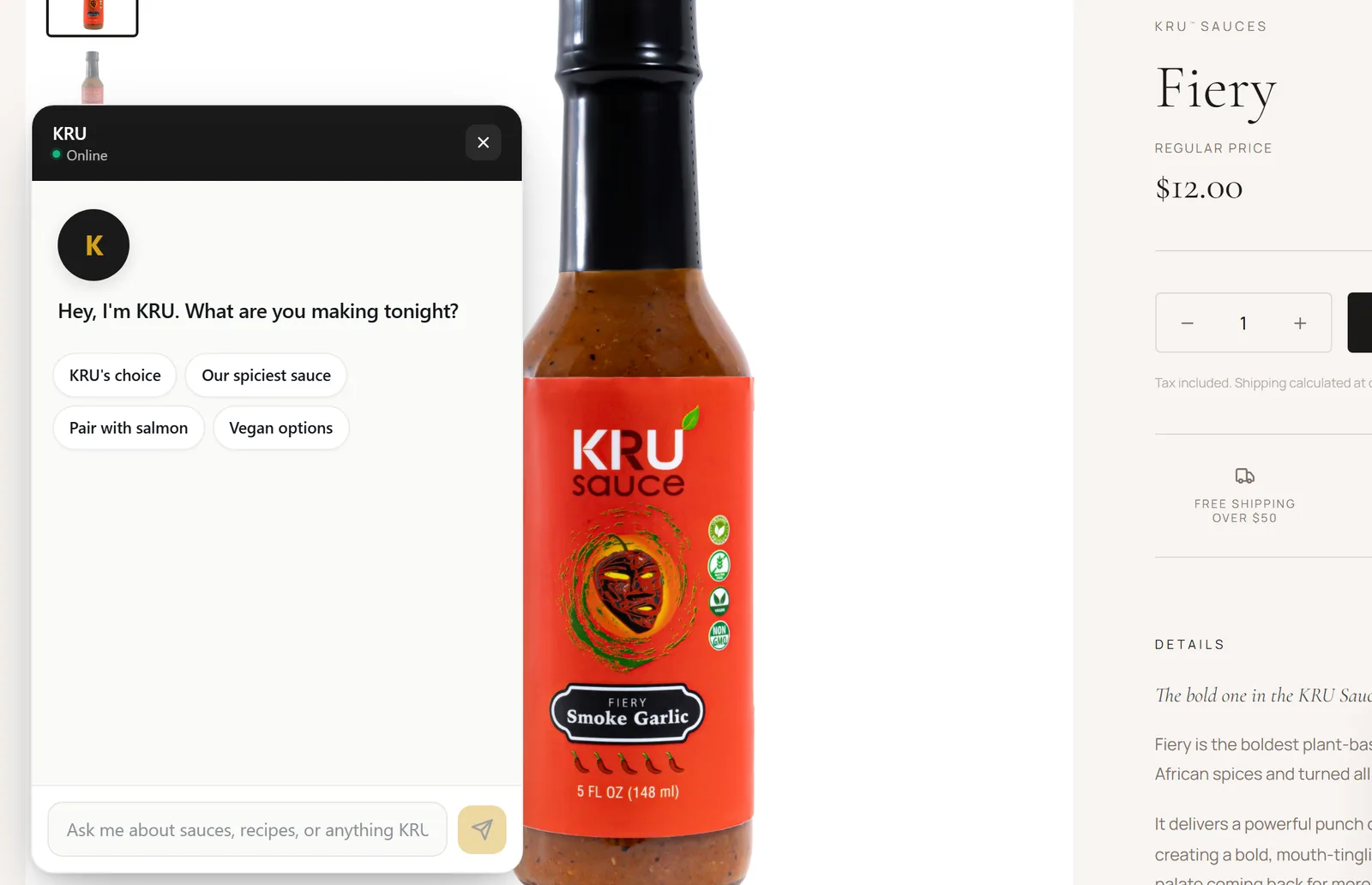
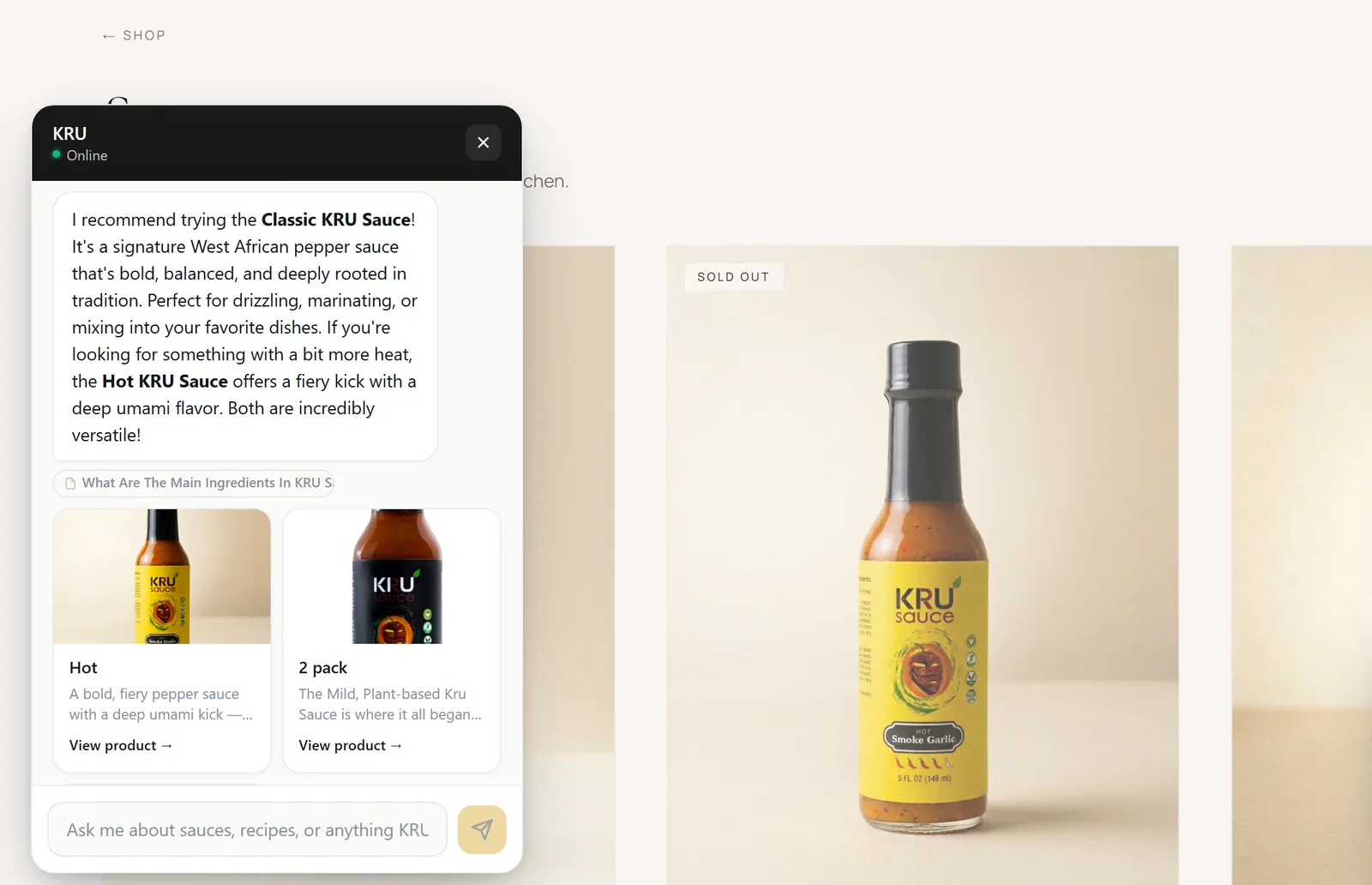
An interactive shopping assistant sits on every page. It opens with a question instead of a form, answers in plain language, and links straight to the product it recommends.
One brand, before and after.
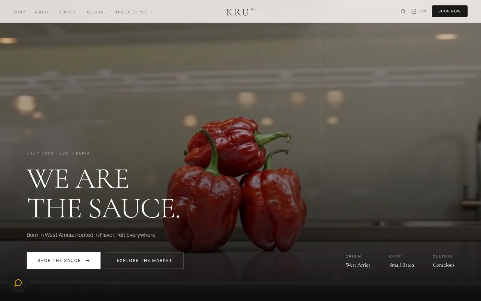
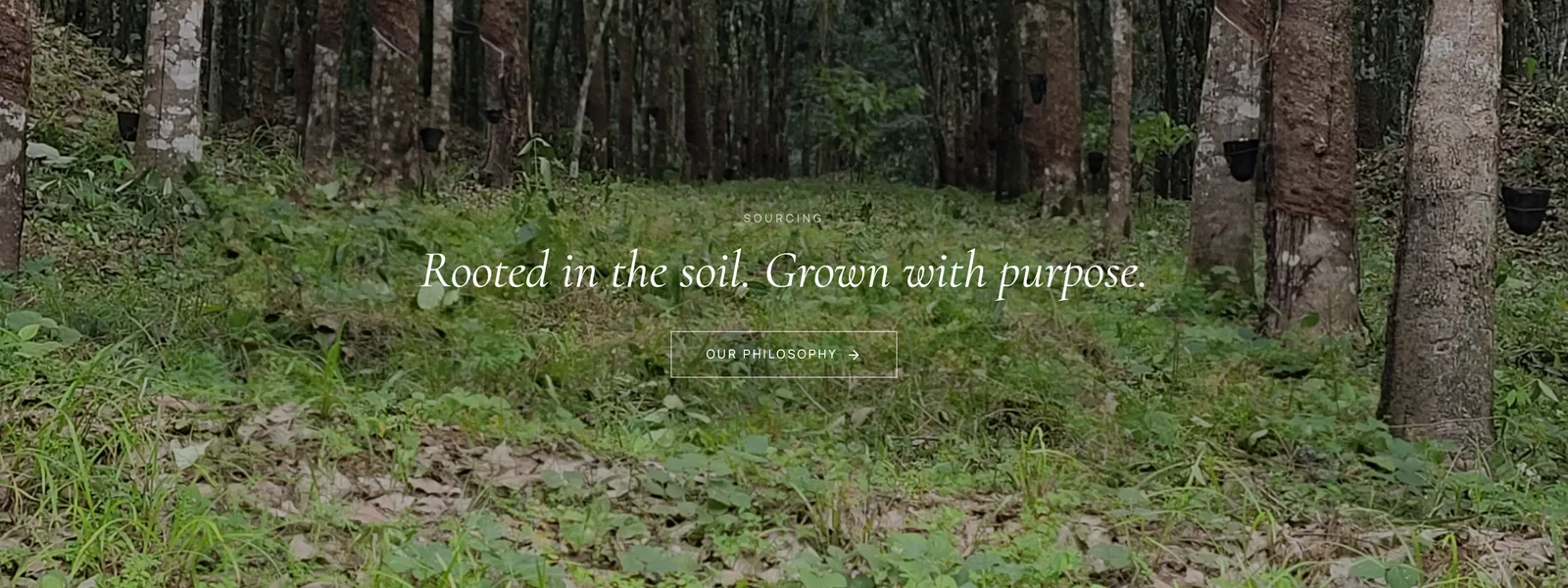
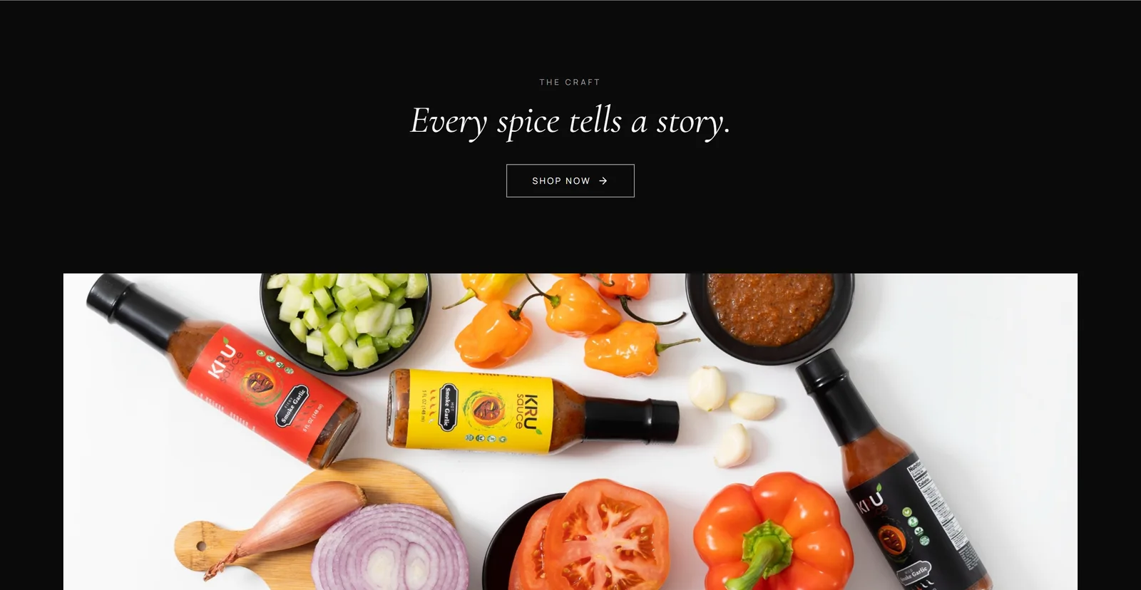
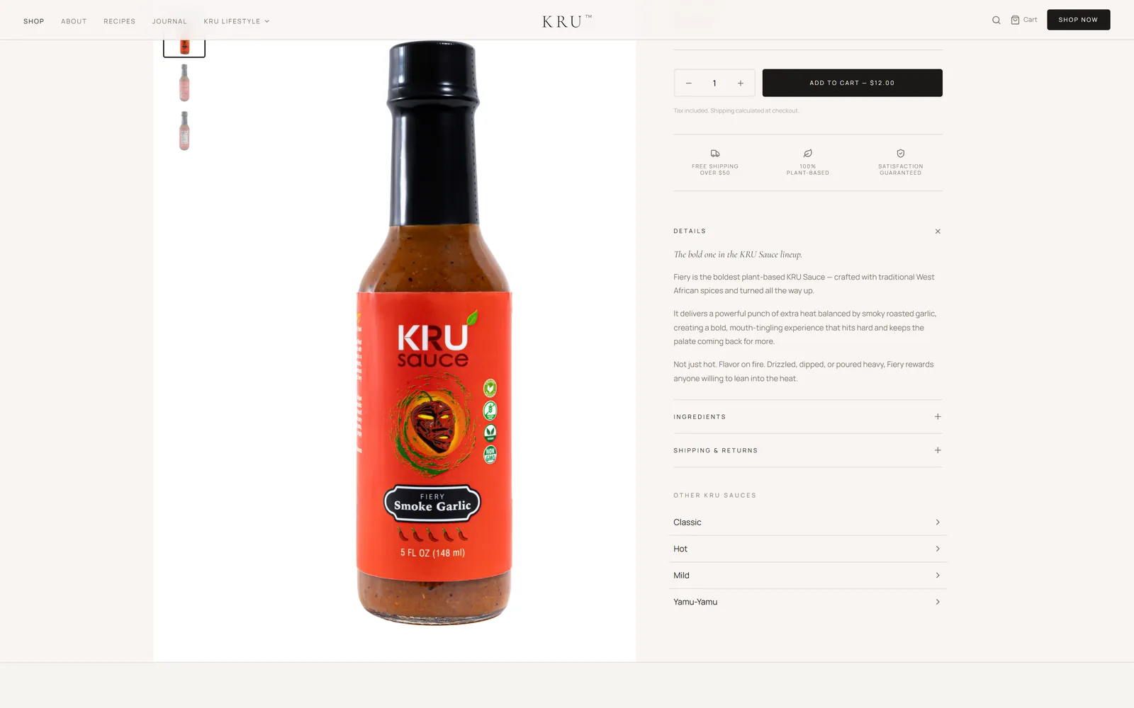
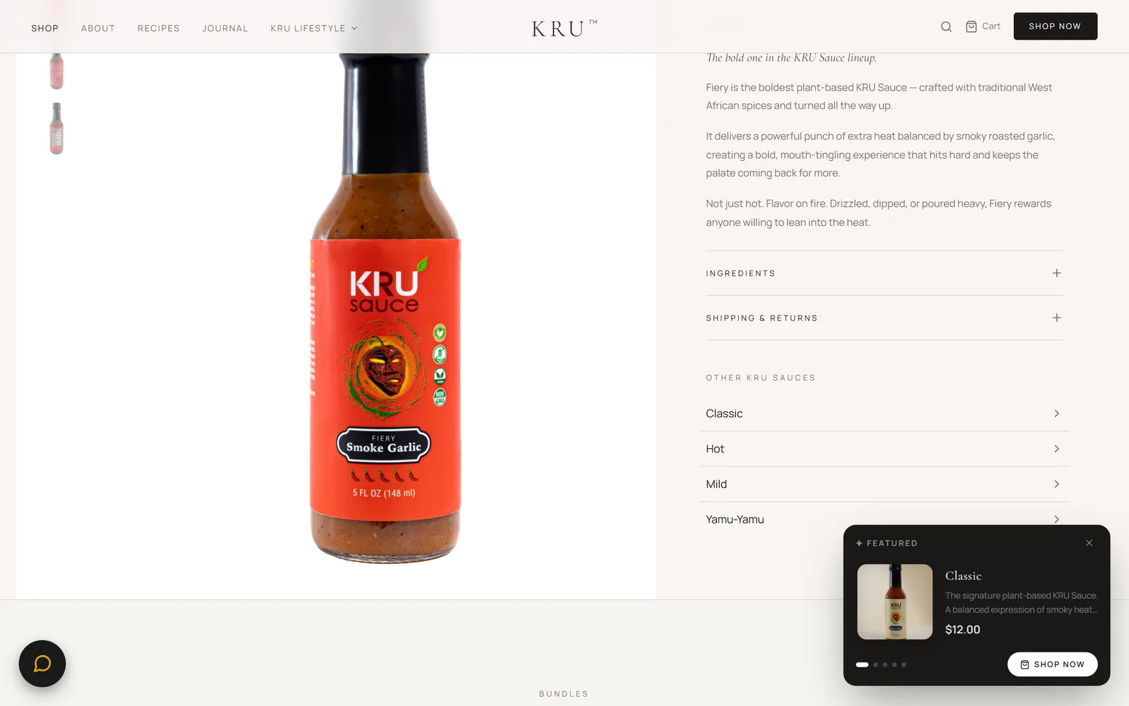
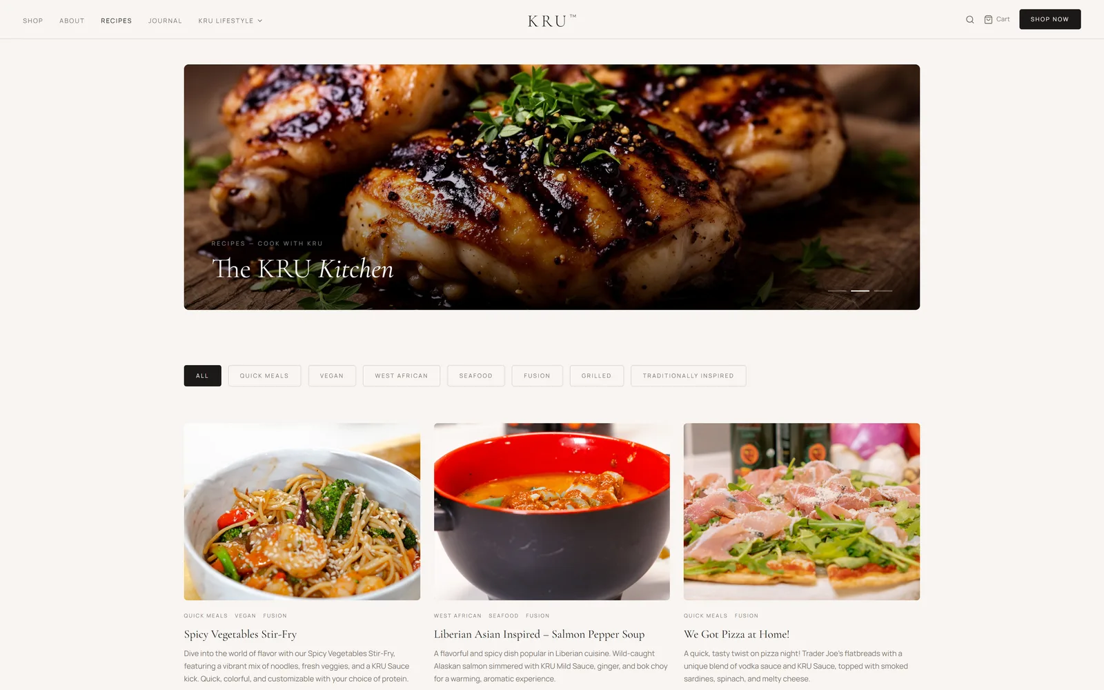
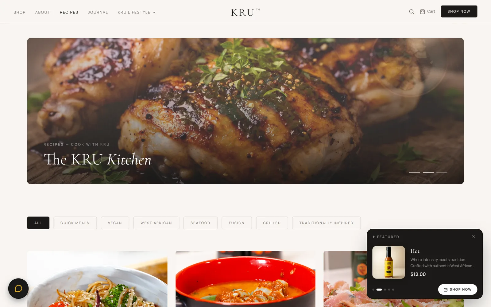
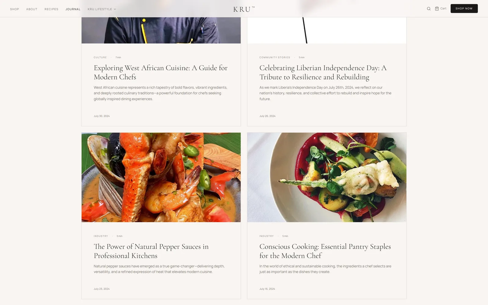
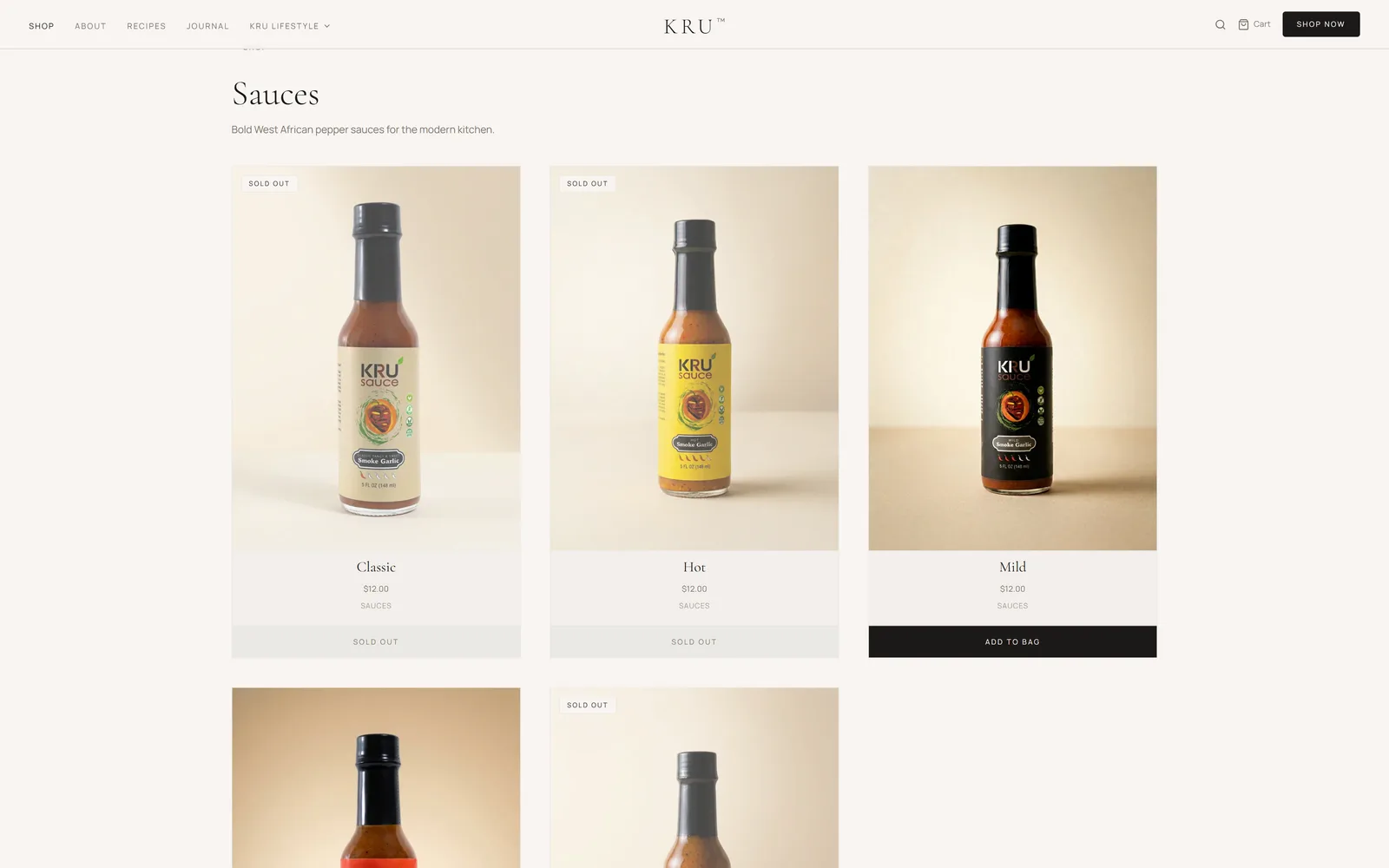
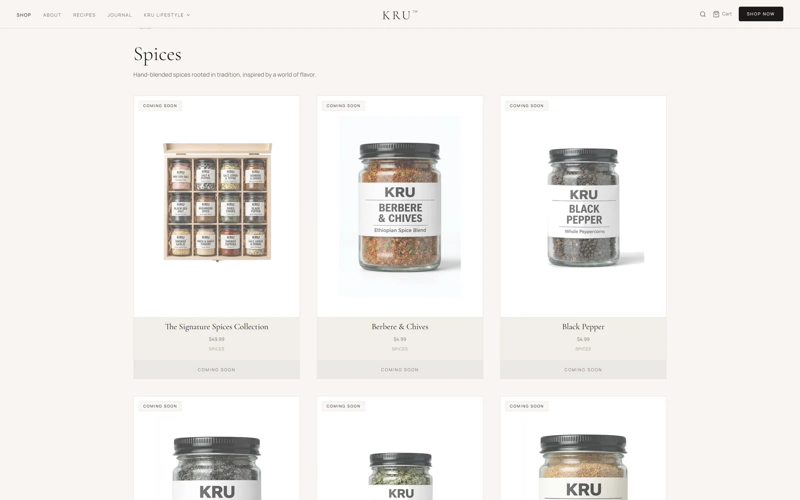
Home
iPhone · 390px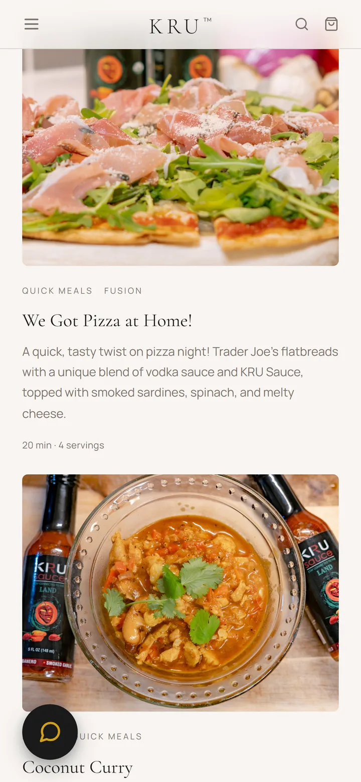
Recipes
iPhone · 390px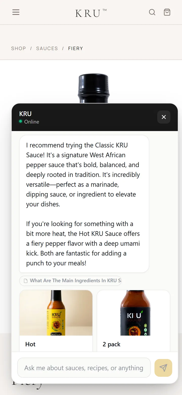
The assistant, on the phone
iPhone · 390px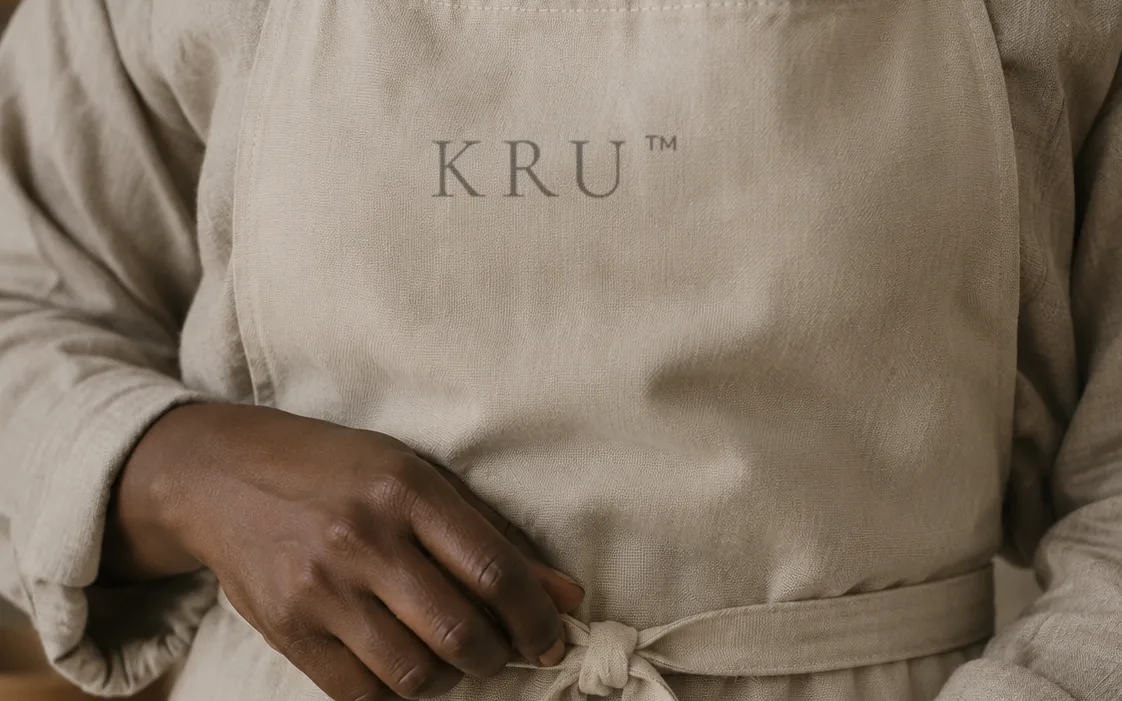
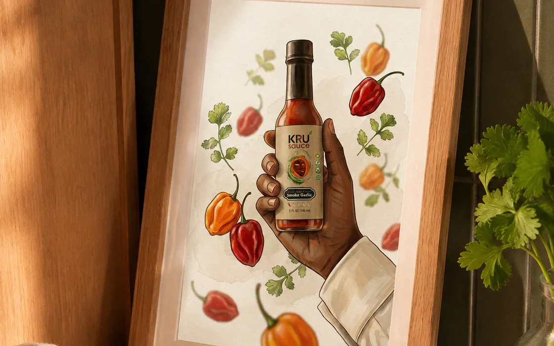
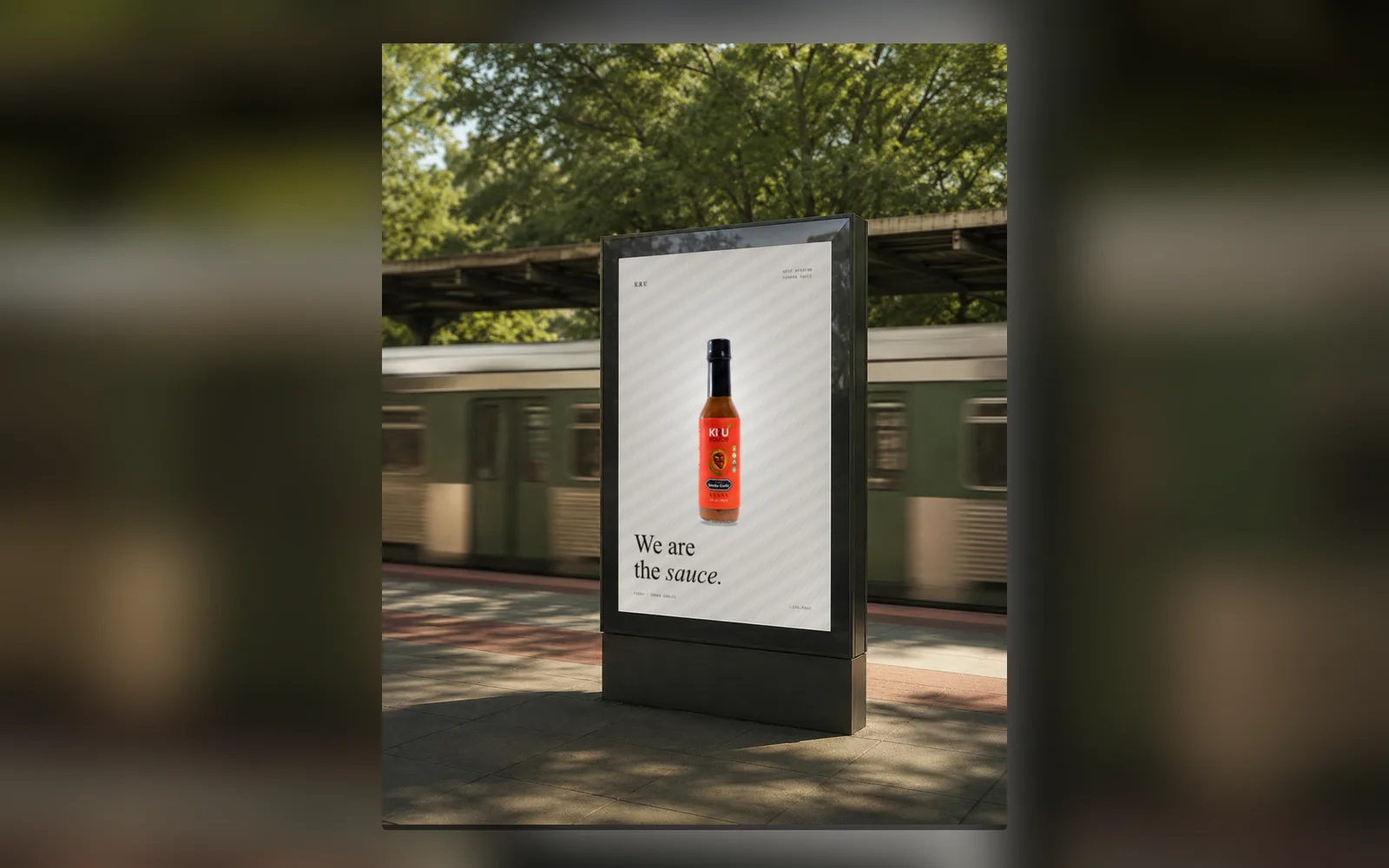
Thirty-three pages, one tree.
The captured structure of the site — shop, recipes and journal branching from one home. Drag around, zoom in.
Site coverage
Numbers from the current audit — every page captured at 4 screen sizes.
Visual system
Cream palette, a high-contrast editorial serif and a supporting sans — pulled from the live site.
The quick brown fox jumps over the lazy dog.